So many quilters have backgrounds or at least interest in the arts generally. So what I am about to tell you is probably contrary to everything you have ever heard from your quilting peers!
The color wheel and color wheel theory has no place in quilt fabric selection! Yep I said that!
What the heck am I talking about?

Here's a color wheel. Primary, secondary and tertiary colors explained in a basic graphic. It is an excellent way to show the relationship between colors BUT it is overused to explain why certain fabrics play well together in quilts. Why? You've probably heard it said that colors opposite each other on the color wheel are complimentary. But what most people fail to follow that up with is the fact that adjacent colors and random colors can be just as complimentary!
So to explain this here is an example using red and green which are opposites on the color wheel:

It looks great! So lets try a tertiary limey green:
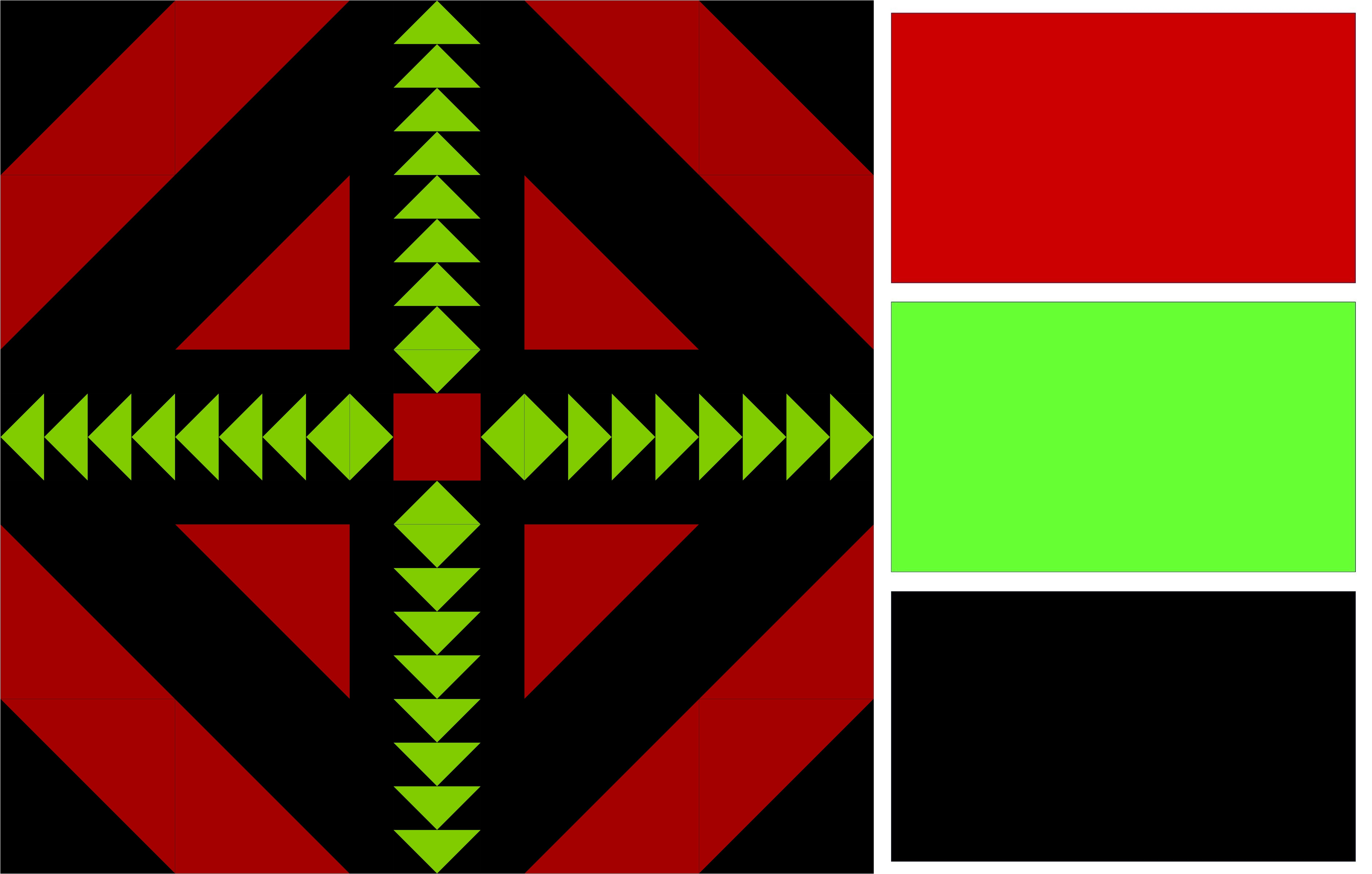
Looks good too huh!
So lets look at red with non-adjacent colors:

Both teal and yellow look great. Are you starting to see a pattern here? Lets try red with adjacent colors. The orangey and purpley color ranges are adjacent to the reds on the color wheel and they also look great.

So why do people use the color wheel to help them choose quilt fabrics? And what is the alternative.
People use the color wheel for varying reasons but most of them come back to the confidence that color wheel theory gives them. They were probably taught that way by people who afterall were trying to explain years of lived experience and knowledge they have in color/tone in just a sentence or two. But we can scaffold that learning for the people we teach without citing irrelevant art theories that weren't designed specifically with quilt making in mind.
The single most important factor when choosing quilt fabrics is contrast!
Do you want the chosen fabrics to have high contrast which will ensure the mathematical/geometric pattern of the quilt is the focus or do you want low contrast so that the fabrics almost blend together as one, such as in a low volume quilt.
Example 1 - bright red and green tones on a black background vs the muted tones of red and green on grey.

Example 2 - bright red and orange on black vs muted red and orange tones on grey

So lets start with just red tones. This quilt does have contrast but it isn't high contrast:

Now see that quilt transition to a couple of fabulous higher contrast options...
First I swapped one of the red tones for blue and the blue elements really stand out!
Then I swapped the background red color for white and we finally get the high contrast! Even a black background is high contrast compared to the initial red tones only quilt.
More Colors & Still Fabulous
In this next example I have used a color from each quadrant of the color wheel:

Purple, blue, orange and lime all together in one quilt and they still 'play nice' so if anyone ever says to you "you can't put those two colors together" just know their knowledge of color theory is in a different place than yours and find a more appropriate color advice tutor.
Prints vs Solids
Another tip if you are struggling with contrast is to start out with solids fabrics! Solids are less complicated because they are less visually complex.
In this example I show the same quilt in print fabrics and then solids:

Color First, Print Later
In this example I chose 3 colors; aqua, mint green and charcoal. The first quilt mockup features solids and then the last example features print fabrics. Obviously the highest contrast is seen in solid fabrics, so that is why solid palettes are a great tool to help with color selection.

Concrete Color Examples
You can use physical examples of color from your environment to help envision a color palette! In this example I have used a selection of thread spools to show a palette of lavender, pink and white:

Some quilters use paint chip examples or fabric color cards.
Summary
None of this means that the color wheel is invalid, it is a great tool to help quilters understand the variations in color that are available in their fabrics. But understanding contrast is far more important to your fabric selection process than color is.
4 Key Points
- Contrast is the most important factor when choosing quilt fabrics
- Solid fabrics are less complicated so if you plan to use print fabrics, decide your palette using basic solids before finding print fabrics that suit the palette
- The color wheel has a place in quilting as a tool to teach about color and variation within the color spectrum but it isn't a tool that I recommend for helping with fabric selection
- Use concrete examples such as paint chips, thread spools or solids color cards as needed to determine the color palette for a quilt.